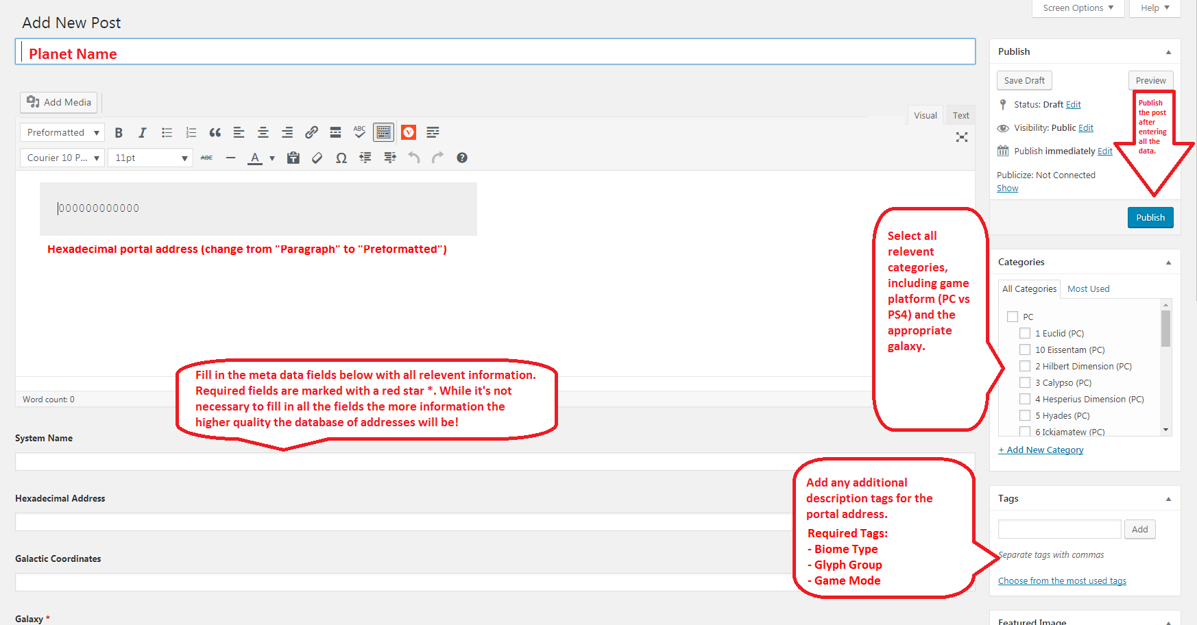
Recently I spent some time redesigning the way portal glyphs are displayed on this site. From inception, glyphs have always been displayed visually as small png images, like so:
![]()
![]()
![]()
![]()
![]()
![]()
![]()
![]()
![]()
![]()
![]()
![]()
![]()
![]()
![]()
![]()
However, the problem with this is that images are pretty resource-intensive and can slow down a website. They are also time-consuming to publish because each glyph has to be added to a post individually. Furthermore, the quality of these icons has always left something to be desired. To that end, I added a custom glyph font (originally designed by Ghuyajil for the Gamepedia wiki) that automatically replaces the hexadecimal address (1-9, A-F) with the corresponding glyph.
I accomplished this using custom CSS rules for all “preformatted” text. Preformatted text uses the <pre></pre> HTML tags. In this case, all the images have been replaced by preformatted hexadecimal codes. This cuts down significantly on server resources and the time it takes to publish new addresses. Also, the font is vectorized, which means that it automatically adjusts size depending on the device it is being viewed on, without losing resolution. See below:
0123456789ABCDEF
This also makes it easier for users to publish posts themselves from the Dashboard. Check out the revised Instructions page for more information.
I’m still tweaking the font size so that it looks decent on most devices. Depending on the size of your screen sometimes all 12 glyphs will fit on a single line, but if not they should re-size and split into two or more rows. I set a minimum size limit on the glyph font so that they wouldn’t shrink so small that they are hard to see. If you see any issues on your device please email me at [email protected] including a description of the issue, a screenshot, and the device/browser/resolution you are using.
What do you guys think of the new glyph font? Leave your comments below!